Summary
Re-design the partnership marketing experience. Travelers who are a member, or looking to become a member, of Sun Country rewards, a partnership marketing experience will allow them to see the full potential of the membership, by clearly displaying the products and services available to them as members.
My Role
User Experience Design (UX Design)
Challenge
One of the large benefits of joining Sun Country Rewards is access to promotions on products and services for our various vendors. Currently on SunCountry.com, we do not advertise this perk for potential members, nor do we make it easy for current members to access the promotions.
Goals
• Easily scan current partners
• See a brief overview of the promotion
• Ability to sign up for the promotion
• Prompt to log in or join Sun Country Rewards
Approach
Starting with current state, the user experience was assessed using a heuristic evaluation method to gather insights on challenges that travelers might be experiencing today. Checked other sites to compare the experience that competitors are offering by analyzing a number of heuristic characteristics of those sites. Interviewed stakeholders including rewards program managers to assess what needs existed as well as pain points. 
Insights
• Difficulty seeing status of offers
• Controls difficult to see and utilize
• Traveler relied on memory for offer recall
• Verbiage is industry specific and not widely known to travelers
• No search functionality
• Long offer descriptions
• Low resolution offer images
• Limited traveler support for clarification, questions and error recovery
• Low offer usage
• Rewards program missing from main navigation
Travelers Journey
The travelers journey for this piece of functionality is simple and pretty straight forward. Defining the travelers journey for this functionality enabled the team to think about how a traveler and the program managers could benefit from updates to this area of the website.

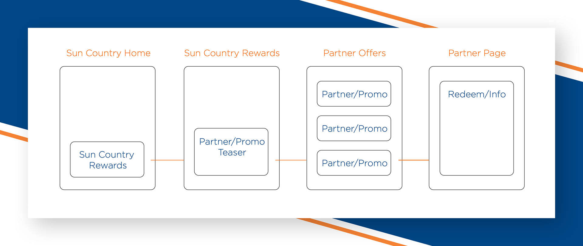
Traveler journey A separates the partner offers on to a dedicated page. This enables navigation from many call to action instances across the Sun Country website, to increase visibility and usage. This separation also allows for a dedicated search functionality to accommodate the program as it grows.

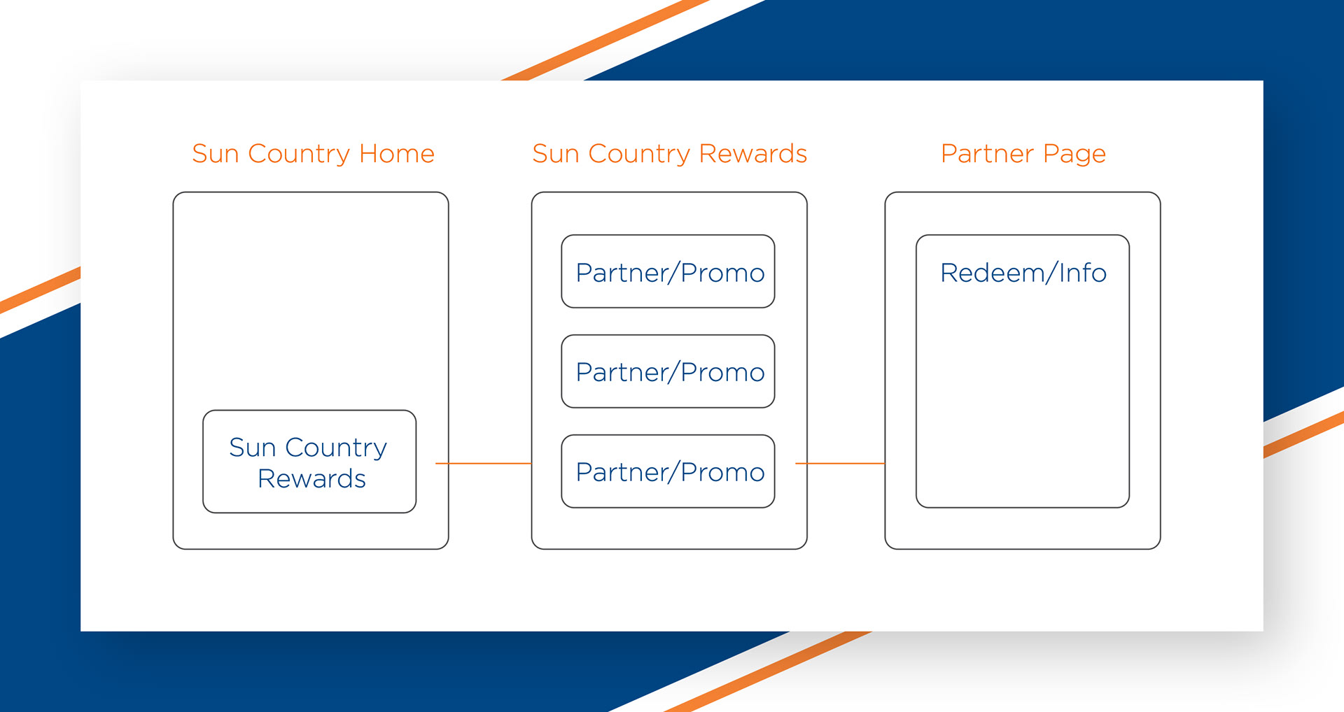
Traveler journey B incorporates a list of partner promos within the existing rewards page and allows the traveler to select from 

Wireframes
Quickly ideating on the two traveler journey's that the team decided might be the best solutions a number of wireframes were created to give the team a feel for how the flow might feel to the traveler.

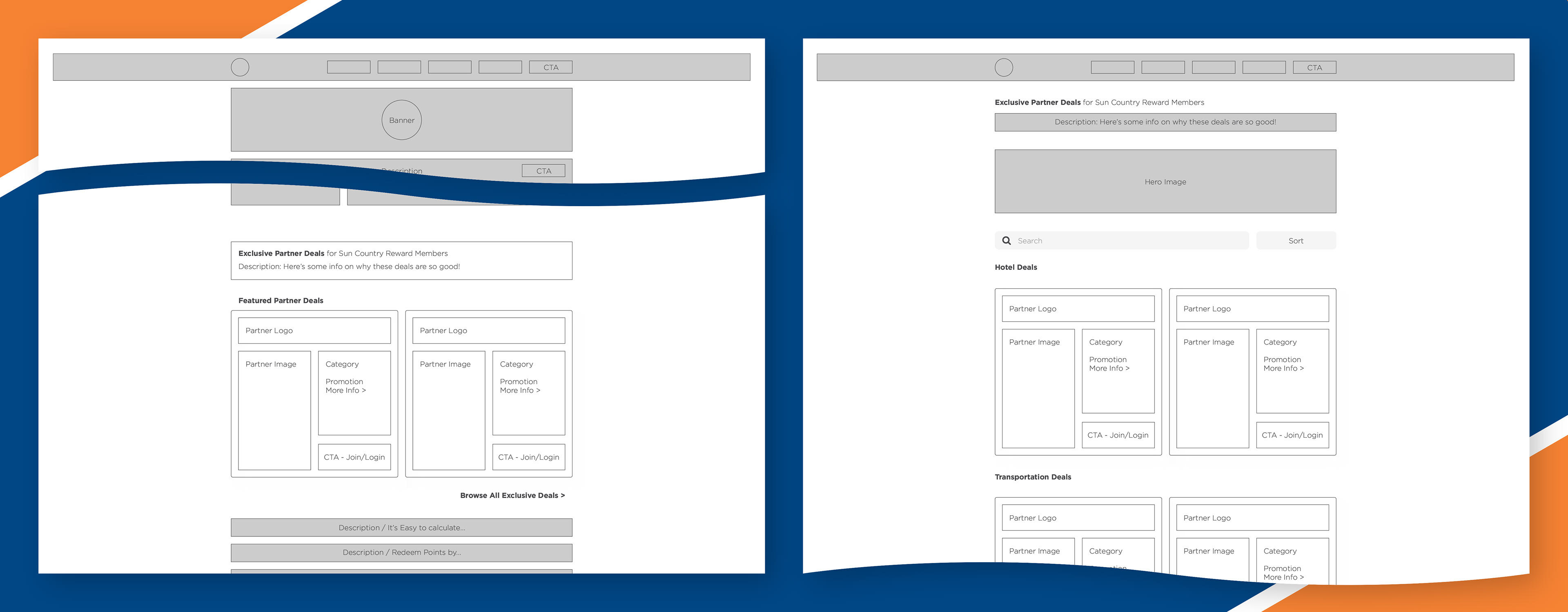
Wireframe 1.) The traveler experience here includes a call to action with a reference to a list page where the partner deals would be listed. The main idea here is to entice action by providing a flavor of what great deals a traveler could benefit from by joining the rewards program. This also allows for content to continue below the partner deals on the page by only showing a preview. As the program grows it will be increasingly important to offer a search function to sift through partner deals. This is made easy by dedicating a page to that end.

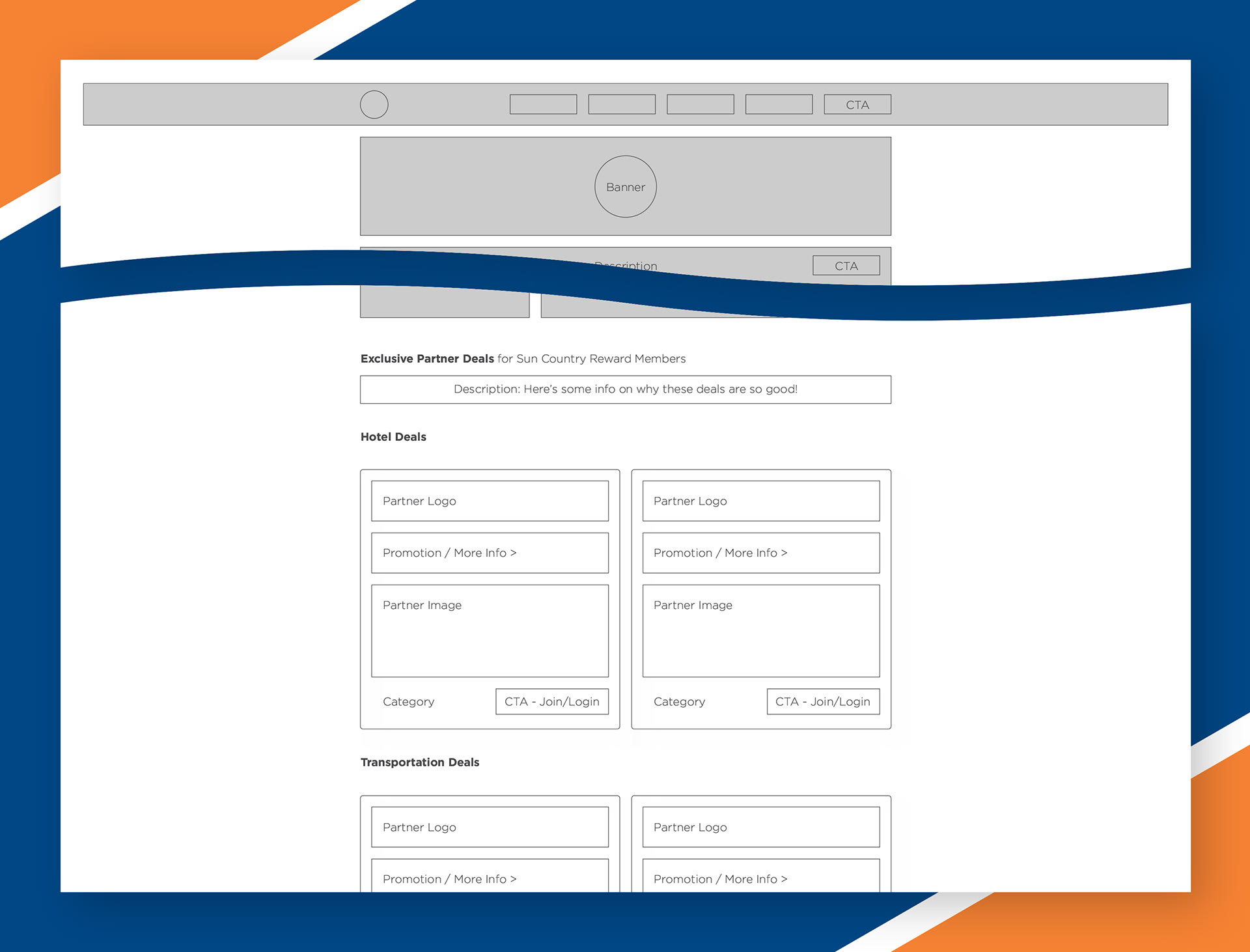
Wireframe 2.) On the Sun Country rewards page the traveler will see the partner deals listed and categorized by industry. Using "cards" the traveler can browse the deals and see what is available. This approach maximizes the exposure to travelers visiting the reward program page but also limits content that comes after the partner deals as they may be pretty large in number.

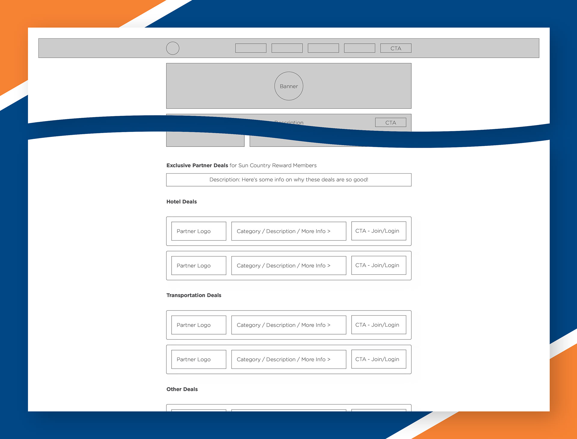
Wireframe 3.) This continues the theme of maximum exposure for partner deals to the traveler. This idea gives a thumbnail preview of each deal to save space for content below the deals. Although the deals are condensed the volume of partner deals may quickly overtake the entire page not allowing for content about the rewards program to continue after this list of deals.

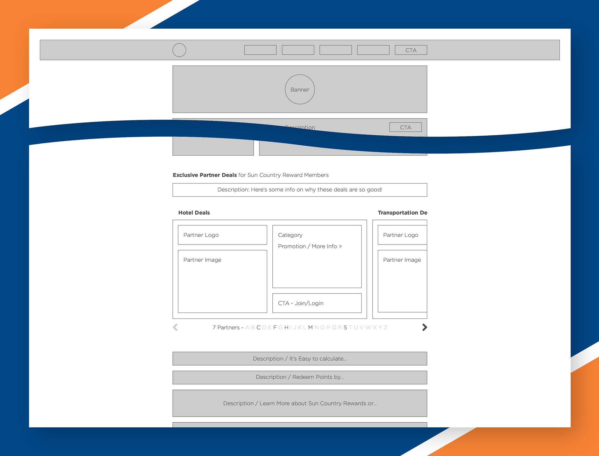
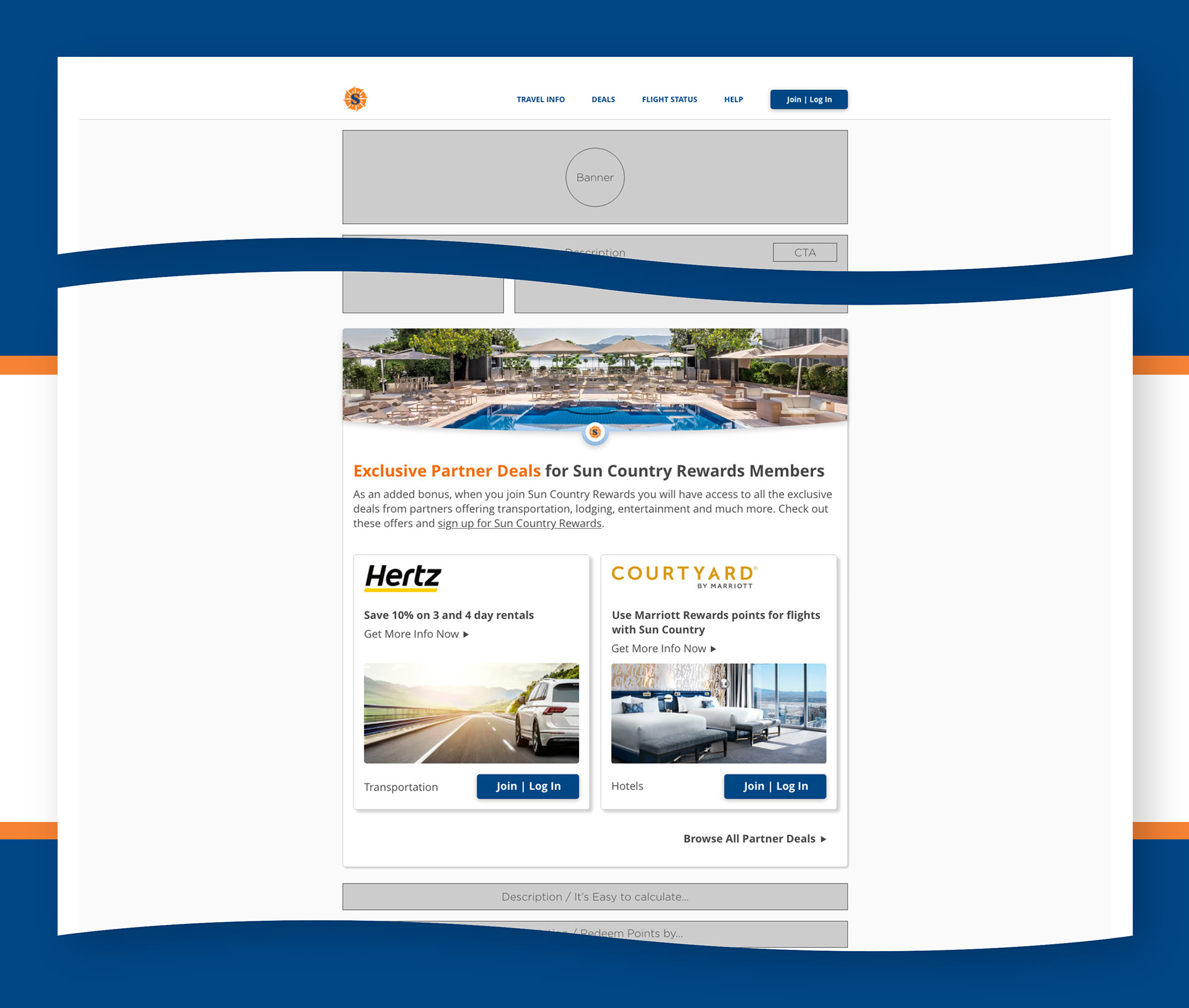
Wireframe 4.) A self contained module that includes an expanded card layout for each deal but remains compact enough to be embedded into the rewards program page. This idea would have partner deals indexed alphabetically to reduce cognitive load and would show how many deals were available relying a bit more on indicators rather than visibility.

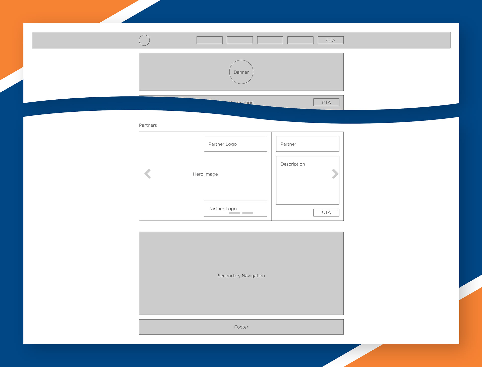
Wireframe 5.) This is an example of how the reward partners were displayed when the website was launched. You can see that the controls and indicators were difficult to see. The design relied wholly on recalled memory of what deals were available. The design was compact and the deals had high visibility on the page however, if you didn't spend some time figuring out the technology, you missed all the offers save, the first one in the carousel.

Prototypes
After meeting with the team and weighing the pros and cons of each design it was decided that we would move forward with the teaser and list option. The design was completed in Adobe XD.
Lessons Learned
Even though it is nice to have all the information on one page, there are instances where it will be mutually beneficial to the organization and to the traveler to break it up a bit. Having the ability to place teasers around the site and to display "featured partner offers" allows the traveler to encounter the rewards program in new ways as they go about their business. At the same time it allows program managers and the sales team opportunities to expand the offerings since there is a search functionality and an indexed list and allows for sales to up-sell premium positions within the program that yield higher visibility and ultimately more volume and revenue.